A guide to how to do Technical Analysis and draw fancy graphs

 |
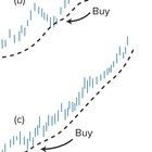
So i previously asked people what kind of posts they would like to see me make, this will be the first of a few posts i make to contribute and help to this sub. I'm sure a lot of people have seen people say they see a Head and Shoulders pattern forming on charts and wonder what in the hell does this mean. No it does not mean you then have to touch your knees and toes. Here i am to explain all the different chart movements. First lets start with the simple ones, Moving Average Models these are used to show support over a daily, weekly monthly (really any amount of time you want to use to suit your view) This chart is used to create a more straightforward line graph to follow that takes into account the average prices for each day it helps to ignore dips where perhaps short sellers have been caught out and the price dips drastically before levelling out again. Falling below or rising above moving average lines are a key indicator to buy and sell. How to make a Moving Average Chart. Since unlike the stock market, Crypto never closes you must first take a specific point in the day to take your price points from. If you would like to make a 7 day Moving average chart, take this data for each of the previous 7 days. (lets use an example of 1,2,3,4,5,6,7) Add these values up and divide by 7 (4) This gives you the first data point for day 7 which is 4, On day 8 the price hits 6, to work out the 7 days Moving average, take this price and the 6 days of figures before hand. (2,3,4,5,6,7,6) repeat the process of adding them together and dividing by 7. (4.71) plot this point below the chart on day 8. Repeating this process for day 8-day infinite will see a line beginning to form from the plotted data. Here is where people indicate whether you should buy or sell. If the chart of coin goes over the moving average line or bounces off the moving average line it is an indicator your should buy. If it falls below the line or if it bounces off the line and falls it is an indicator to sell. The most common moving average charts are 10 day which picks up short term changes and 30 day which picks up long term trends. The next charts we will look at and i will try to explain is trend lines. These are fairly simple and just involve drawing straight lines on graphs. An upward Trend line this is drawn connecting the lowest points of an uptrending coin A downward Trend line is drawn connecting the peaks of coins that are falling in price. Return Lines, This is a line that is drawn parallel to the line that has been drawn on the charts, if a chart does not reach the return line after a dip or a rise, it can indicate a change in the motion of the charts. How are these lines used? The longer a trend line has been in force, and the more times it has been tested, the greater is its validity. Meaning it can be then followed to predict future price points for the coin. If a trend line is of long standing and has withstood three or four tests, and then an indecisive break is experienced, this penetration can be ignored and the original trend retained. Once a trend is broken on the downside, prices fall from it and then often make a return move towards the line. The pullback frequently retraces approximately 50.00 per cent of the move away from the trend. This pullback provides a good sell point, if the trader has not already sold at the break of the trend. Next up on the list we have RESISTANCE AND SUPPORT LINES. You hear the phrase Hold the Line? its quite literally trying to keep the price point above a line on the charts. A resistance line is a line at the top of a coins charts that indicates where there is a large sell wall, these resistance lines and sell walls are used to keep prices within a certain price range (this can be handy for whales who are looking to accumulate) A break of the Resistance line basically means the sky is the limit for the coin as sellers now fight to create a new higher sell wall. A support line, this works in the opposite way. This is a line in the charts where at a certain price point for the coin there is a large buy order that will counteract any selling of the coin and will help the price to recover upwards. The same as for resistance lines, if this line is broke then a downwards fall is predicted for the coin as a new support line needs to be created. Looking at these lines for resistance and support lines we can see why people use the terms ascending or descending triangles. If the last bottom does not touch the support level, beginning the formation of an ascending triangle, and if prices then rise rapidly, on increasing volumes, it is likely that there will be a topside breakout. (to the Moon!) Conversely, if the tops fail to reach resistance levels, beginning the formation of a descending triangle, then a downside breakout is likely. (breaking the support level) Now we have started to look at shapes its important to look more at triangles and introduce flags and pendants. There are three main types of triangles that are used on graphs, Symmetrical, Ascending and Descending Triangles. A symmetrical triangle is drawn on a graph when each top and bottom in the chart is smaller than the last, On a chart it looks like a ripple that is slowly ending. This is probably the hardest of the three triangle times to decide what will happen with the price point. Ascending Triangles, These triangles are formed when the lowest point of the dip is higher than the last, whilst the top of the trend is almost horizontal. An ascending triangle on a chart means a break out is ready to happen! Descending Triangles, the opposite to ascending these are formed when the top of each movement is lower than the last top but the bottom price point forms a horizontal line. This is not good and it signals a price dump in the near future. Finally we have Flags and Pennants. These are typically only formed and used during very fast moving growths or losses. When a price rises sharply before then forming highs and lows at a higher price point the sharp rise is considered a pole for the chart whilst a triangle is then drawn on the new highs and lows. Or the opposite if the price falls very quickly (An upside down Pennant is made) Flags are formed when the price points after the steep rise or fall follow a more parallel/ horizontal movement at their highs and lows. The assumption that is made fairly often by analyst is that the next price breakout will be equal to the level that the pole reached before forming either the flag or the pennant. These are some of the most used drawings by analyst and can be trusted when performing TA on charts. The final chart analysis i will explain is the HEAD AND SHOULDERS pattern. A head and shoulders pattern consist of three seperate rallies for the coin with the second rally being greater than the first and last rally of which these two would be sort of similar. The left shoulder on the graph forms as an increase of volume is introduced to the charts. This sees a rally towards an upwards trend to begin the formation of the HEAD, The head reaction sees a second stronger rally than the first that takes the coin to new highs. The volumes during the head are not as strong as during the growth on the left shoulder and therefore do not hold. This leads to the formation of the Right Shoulder It is the third rally for the coin that holds both a lower volume and also a price weakness for the coin. The key aspect of the Head and shoulders is the formation of the *Neckline* For the price to continue upwards after the right shoulder it needs to bounce of the Neckline, if it fails to do so we will see a price drop. Finally as an added treat we will explain the Elliot Wave Theory, Based on the work of an American Analyst. He has shown the existence of distinctive wave patterns that characterise share-market cycles. The key proposition is that a bull market it consists of three major waves upwards, followed by two major down-legs, which result in a reversion of share prices to about 60.00 per cent of the peak. These two downward retraces are important for the coins growth before the continuation of the next Bull trend. I hope i have helped to add some clarity to some of the Techincal Analysis that is done within this sub. If you have any questions im happy to help. And for general stuff you can always find me or loads of other helpful souls in the Daily Thread 🙂 submitted by /u/Slayerofgondor |