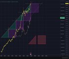
Near Perfect Correlation Between Bitcoins ATH and the M2 Global Money Supply
| |
This chart shows the M2 global money supply in yellow, with a trend-line drawn between the exact M2 money supply value on the date of each bitcoins ATHs. this trend line is the (Red Dotted Line) The (purple dotted trend-line) shows the trend between all of bitcoins ATH’s (Green triangle) area between M2 tend-line and cycles ATH (Purple Square) area under M2 trend-line from previous ATH to next cycles ATH Here is the pattern. If we now simply compare the area between these green triangles and purple squares, we can see a near perfect correlation. Photos #2 and #3 are the best examples. Where the red triangle from the bottom right is copy and pasted and overlaid for each section of the chart, same with the red square. As we can see, each cycle has near identical shapes and areas under the M2 trend line and between the ATH trend line. Specifically here is areas for each each halving area between the trend lines. Purple Rectangles • 2013 to 2017: 10,473,288.84 • 2017 to 2021: 10,101,604.60 • 2021 to 2025: 10,181,862.10 Green Triangles • 2009 to 2013: 4,544,581.42 • 2013 to 2017: 5,243,998.50 • 2017 to 2021: 5,269,289.40 • 2021 to 2025: 5,338,080.98 This means the area and shapes for the triangles are 99% identical And the area and shapes for the rectangles are also 99% identical What does this mean. Who knows. It could mean absolutely nothing. I just like to find interesting patterns In bitcoins data. Enjoy. Here is the link to the trading view chart https://www.tradingview.com/chart/BTCUSD/D1EaJjmF-Patterns-In-Bitcoin-ATH-Against-M2-Money-Supply/ submitted by /u/bitcoinovercash |